Table of Contents:
-I. Introduction
-II. Getting Started
-III. Color Theory
-IV. Transparency
-V. Final Steps
-VI. Examples
------------------------------------------.~*\/*~.------------------------------------------
-I. Introduction:
So, you just made a fresh new guild or just want a change, and decided that you need an awesome emblem. I am here to help! In this guide I cover the basics, techniques, color theory, transparency, and how to finish your emblem. For this guide I am going to be using one of my previously made emblems, which I made for fun. So, I hope you enjoy and will be able to make an awesome emblem yourself. Let’s begin.
------------------------------------------.~*\/*~.------------------------------------------
-II. Getting Started:
To begin, you first need an idea of what you want to create. You could sketch it down on paper or just brainstorm about it. I usually just brainstorm and work it out on Photoshop (personal preference). Speaking of Photoshop, you will need some sort of program to even begin creating your emblem. Most art programs will do. These are three most common programs I know of that you can use.
-Windows Paint (This is located on almost every Windows computer, FREE!)
-Adobe Photoshop
-Paint Shop Pro
1) Open your program. I personally use Photoshop, so that’s what I will be going by for this guide. Once the program is open, go to “File” > “New”. This should bring up a separate window that will give you some options.
2) In the window, change the Width and Height box to equal 24 pixels in both. The color mode should be RGB Color at 8 bit. So the window should end up looking something like this.
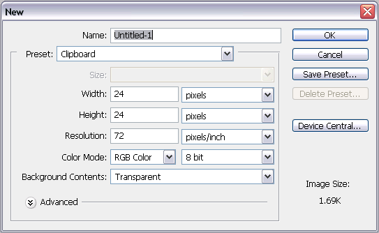
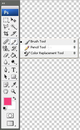
3) Hit “Ok”. This will open another window that should be scaled to the correct size that we entered. (It’s really small!) Now that you have your work space, let’s begin drawing. Move your cursor over to the Tool Box (the bar located to the left of the screen) and click and hold down on the Brush tool. This will bring out a small drop down menu. Select “Pencil”.
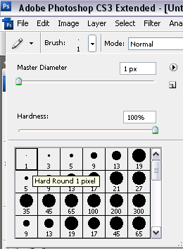
4) Next, find the options bar (located right below File, Edit, etc…). There will be an area that says “Brush” and has the size and current brush listed. Next to it is an arrow. Click on the arrow and you will get a drop down menu. Here you want to pick the first brush. It should be called “Hard Round 1 Pixel”.
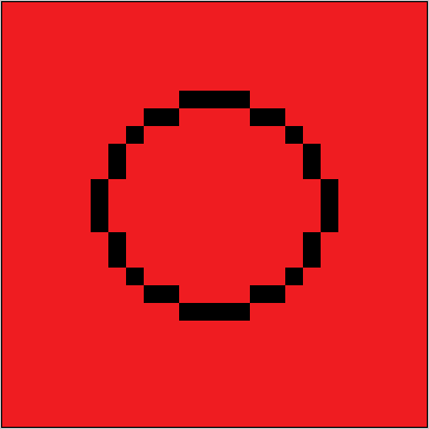
5) Now you get to select your color and begin drawing. You should probably zoom in about 1600%, for a good view. Usually I will do a really rough sketch of the outline for the emblem, first. One thing you have to remember is that you are using a pixel now (which is why it’s called pixel art). Pixels are small blocks of color that make up your image, so it will be rough but have a defined edge. I will explain why I use pixels later on in the Transparency section.
6) Once you make it look close to how you want it, clean it up. Define the edges to make them smoother and finer. Work out all the curves to ensure that once you zoom out, they look like a real curve instead of blocks. Here are some examples of curves:
Circle:
(Zoomed in 1600%)
(View set at 100%)

Rounded Edge:
(Zoomed in 1600%)

(View set at 100%)

Heart Shape:
(Zoomed in 1600%)

(View set at 100%)

So, this is what my outline ended up looking like for the squid (this 100% view, also ignore the red background it’s just there for you to see well):

7) Once you background is set and perfected, you can begin coloring in. Make sure to keep the outline and the color fills on separate layers. This is so that you can adjust one without affecting the other, which will be handy for the finishing touches. Be sure to color within your outline, unless you really want to color outside it then go ahead. Before going any farther into the actual emblem creation, let’s jump into color theory!
------------------------------------------.~*\/*~.------------------------------------------
-III. Color Theory:
In order to have the hawtest emblem on the hard streetz of eRO, you need to make sure you emblem’s colors aren’t totally whack! To do this you need a quick lesson on color theory. Now, I know there are several color styles out there, and I am not trying to nitpick on exact color choice, but I will try to lend you some tips for picking the right colors and some provide you with some examples of what not to do.
Darkness and Brightness of Colors
Have you ever seen one of those emblems that have extremely bright colors that burn your eyes or with super dark colors that you can’t make anything out? In my time on RO, I have seen quite a few of those. They are just EW. When picking your colors, you should try to find the right tone that isn’t too dark, too light, and too bright. If you are too choose any of those tones of colors, and then it should be kept to a minimum. Maybe use them for a thin border or something of such, but never use them in a major part of your emblem. If you use too many light tones, no one will be able to make out what is what, and the same for dark tones. If you have super bright colors and you aren’t trying to make ridiculously bright emblem, then it will just turn out eye-piercingly ugly. I am going to use this gay bunny guild emblem I made for the lulz (it was random ok >.>!).

Whenever I adjust the color of the rainbow in the back into really dark colors, you can barely tell it’s a rainbow. It looks like a big slab of ugly sitting behind the gay bunny.

Whenever I adjust the colors to a very light tint, it’s so light that it blends in with the white outline.

And when I change the colors to an even brighter version then they already were (which is kind of cutting it close for this emblem), it just looks retarded. The blue kind of hurts when I look at it.

Color Choice
This is super important! Color choice can determine whether your emblem is like a beautiful rose, or if it looks like throw up. So yeah, pretty important. You want to pick colors that are a bit similar, but not too much alike (usually something that share the same base color and tone, like how blue and green both have a base of blue), colors that contrast each other, and the three primary colors will go with each other (Red, Yellow, and Blue). If you pick colors that don’t really share the same tone/tint, then you might get a really nasty color combo.
When you use the correct tones, your colors can flow very well. Also, if you use colors that share bases or are very close tint of a primary color, then it will improve even more unto your emblem. Contrasting colors are opposites, but since they direct opposites, they can work really well as well. This is an example of such aspects:

If you look closely, you will notice all the shades are very pastel like. Because they are similar in such a way, the color really flows well. And the first three colors are your primary red, yellow, and blue. Then the rest sort of cascade based of color bases. Blue > Green (Blue/Yellow base) > Purple (Blue/Red base) > Pink (Red/White base). The brown to the very right could match up with any of the colors and give a sort of retro feel.
When tones are completely offset and bases don’t match up, you could end up with an ugly mess like this:

The top 3 colors kind of make a vomit look. The yellow and green are decent, but vibrancy of the green just offsets them. And the blue and purple/pink color just doesn’t flow with the other colors.
Now that you have a good idea of how colors work, with some “do’s” and “don’ts” we can continue on to the next step.
------------------------------------------.~*\/*~.------------------------------------------
-IV. Transparency:
A lot of people wonder how to give an emblem a transparent background, and it’s rather easy.
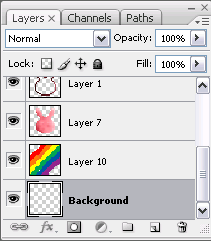
1) First, create a new layer in your layers palette. This is for adobe and paint shop pro users. For Paint users, this doesn’t apply to you.
2) Drag and drop the new layer below all the other layers. This way the background won’t cover up any of your foreground images.
3) Now, you can either copy or save the following image, to use the color picker tool on and get the color. This is the color we need to make the background transparent. If you don’t want to use the color picker then you can just insert the color code in the color menu. The code is: FF00FF.

4) Now grab the fill tool and simply fill the background layer with this color. If you are using paint, then just fill in the areas that would be considered a part of the background with the pencil tool. It’s a bit more work, but the outcome is worth it.
5) So whatever area you left blank to be transparent should be filled with this pink color. BUT IT MUST BE SOLID. As I mentioned earlier, we are using the pencil tool. Because the pencil tool creates solid rough pixels, they don’t blend with the other colors. If the colors were to blend even a little bit with the pink, it would cause the new blend to no longer be transparent. Instead of a clear background, you would have a weird pinkish color present.
------------------------------------------.~*\/*~.------------------------------------------
-V. Final Steps:
We have an outline, we have the basic colors laid out, and we have the transparent background. What’s left? The finishing touches. An image that has no depth is boring and flat. We need to add some shadows and highlights.
1) First, figure out where your light source is. Light source is as the name suggests, the source of the light located in the image. It affects where the highlights and shadows will fall on your image. The areas closest to the source will have a highlight, while areas farther away will have shadows. For my octopus emblem I decided to place the light source in the top right corner.
2) For the highlights you should use about 3 shades of the base colors. The first shade should be just a tad bit lighter than the base. You want to use this color to smoothly blend the highlight and base. Use it to outline the other shades. The second color should be several shades lighter and decently close to white, but still hold some color. This will be the major portion of your highlights. And, the third shade will either be white or very close to white. Use the third shade sparingly, in places that are really close to the light source. Once you have placed down the highlights, if you aren’t satisfied with the blend you created, then you can use the blur tool (ONLY INSIDE THE OUTLINE) to blend it better. Here’s an example of the highlights:

3) Shadows work in the opposite fashion. Areas that are farther away take on darker shades of the base color. Just as you used 3 shades of the base color for highlights, you will do the same for the shadows, but these will be darker. They take on the same aspect. First shade is the blender, the second is the base, and third is used sparingly in areas farthest away from the light. You can use the blur tool here as well, but you remember to keep it inside the outlines. Here is an example of the two.

4) To finish up the image, you give extra little details. One that I like to use is applying the same highlight and shadow effects to the outline. Just be sure to keep the outline solid and NOT blurred with the background!
5) Finally you have finished your emblem! Woot! But, we need to save it. As you would with any image/document go to File > Save As. You can name the image whatever you like, but you must change the file type. Click on the drop down menu for the type and select “.BMP” or “Bitmap.” The image has to be saved as this in order to work in RO.
6) After saving the image, we need make sure it is in the correct location. So locate the saved file then copy and paste into the following:
My Computer > Local Disk (For my computer it’s the C Drive, it may be different on yours) > Program Files > Gravity > RO > Emblem
If you don’t have an emblem folder, then just make a new one and name it “Emblem”.
7) Finally, just log on your guild leader character and apply the emblem. Tada! You have your awesome guild emblem!
------------------------------------------.~*\/*~.------------------------------------------
-VI. Examples:
Here are some examples of other emblems I have made, enjoy!


THE END.

No comments:
Post a Comment
No Racist or abusive comments please.